
In today’s digital age, a website is no longer a luxury – it’s a fundamental necessity for any business. But simply having a website isn’t enough. With the ever-increasing dominance of mobile devices, ensuring your website offers a seamless experience across all screen sizes is crucial. This is where responsive website design comes in.
The Mobile-First World: Why Responsive Design Matters
Think about it: how often do you browse the internet on your desktop computer anymore? Statistics tell a clear story: in 2023, mobile browsing surpassed desktop usage globally [source: Statcounter GlobalStats]. This trend is only expected to accelerate in 2024 and beyond. If your website isn’t optimized for mobile devices, you’re essentially shutting out a massive portion of your potential audience.
A non-responsive website on a smartphone translates to clunky layouts, tiny text, and frustrating navigation. Users will likely abandon your site in seconds, leaving a negative impression and hindering your ability to convert visitors into customers.
Benefits of a Responsive Website Design
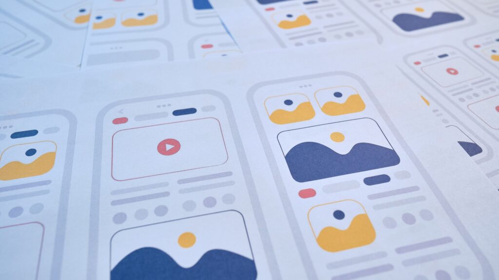
Responsive website design ensures your website adapts automatically to different screen sizes, from desktops and laptops to tablets and smartphones. This translates into a multitude of benefits for your business:
- Enhanced User Experience: A responsive website provides a smooth and enjoyable browsing experience for all visitors, regardless of their device. Easy navigation, clear visuals, and properly scaled content keep users engaged and foster trust in your brand.
- Improved Search Engine Ranking (SEO): Search engines like Google prioritize mobile-friendly websites in their search rankings. A responsive website is more likely to rank higher in search results, making it easier for potential customers to find your business online.
- Increased Conversions: A user-friendly mobile experience translates to more leads and sales. When visitors can easily navigate your website, find the information they need, and take desired actions (like making a purchase) on their mobile devices, conversions are bound to increase.
- Brand Consistency: A responsive website ensures a consistent brand image across all devices. This reinforces brand recognition and builds trust with your audience.
- Cost-Effectiveness: Maintaining a separate mobile website is a thing of the past. Responsive design allows you to manage a single website that caters to all devices, saving you time and money in the long run.
Investing in Your Business Growth
In 2024, a responsive website design isn’t a fad – it’s a necessity for any business that wants to thrive in the digital landscape. By offering a seamless mobile experience, you’ll reach a wider audience, improve brand perception, and ultimately drive business growth.
SEOpologist Can Help
SEOpologist specializes in crafting beautiful and responsive websites that deliver exceptional user experiences across all devices. Our team of web design experts can help you create a website that reflects your brand, engages your audience, and fuels your success. Contact SEOpologist today for a free consultation and see how we can transform your website into a powerful mobile-friendly conversion machine!

