Creating a captivating and effective color scheme for your company or website can be a challenging task. The colors you choose play a vital role in conveying a specific message to your clients and visitors. With various options available, it’s important to consider the look and feel you desire for your website. In this article, we will explore different color schemes and their impact, helping you make informed decisions for your website’s color palette.
Foundational Color Theory

To begin, let’s establish a basic understanding of color theory by exploring the color wheel (image to your left). The color wheel is a visual representation of colors arranged in a circular format, illustrating the relationships between different hues. Colors on the wheel are organized in a manner that places similar shades next to each other, while the most contrasting colors are positioned across from each other. Below are a few ways you can combine color on the wheel to make a cohesive color scheme.
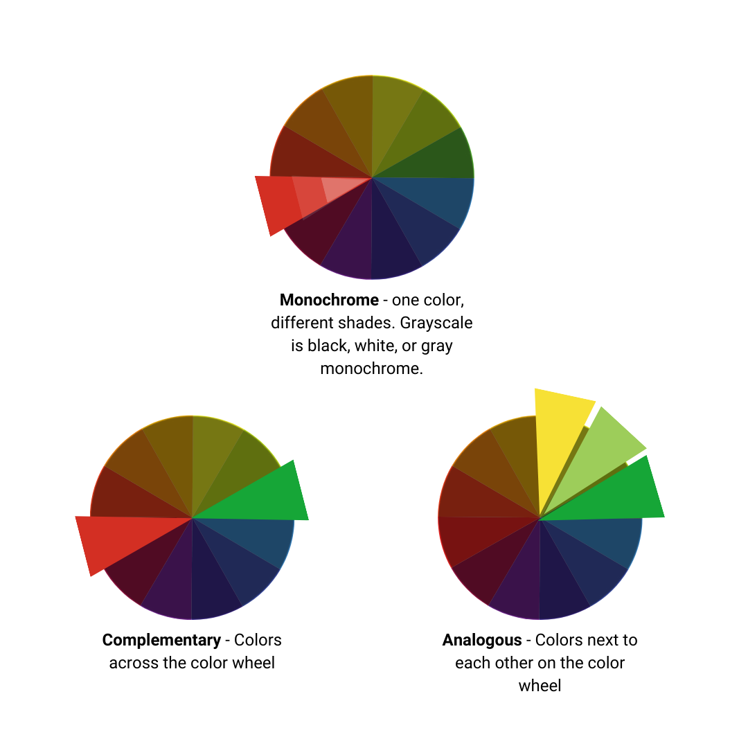
Let’s take a look at these color in action.
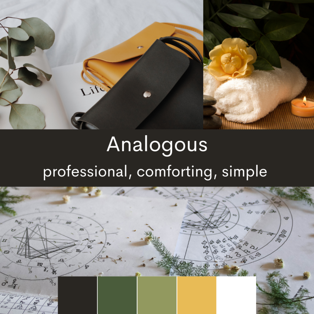
Analogous Color Scheme
If you seek a cohesive and harmonious color scheme, the analogous color scheme is an excellent choice. This scheme involves selecting colors that are adjacent to each other on the color wheel.
The proximity of these colors creates a sense of comfort and relaxation. An analogous color scheme is both professional and easy on the eyes, making it suitable for a variety of purposes.
Consider using an analogous color scheme for a simple and professional look. For instance, a spa, health company, or lifestyle brand may benefit from the peaceful and cohesive ambiance created by this scheme. To the right is an example of what an analogous color scheme could look like.
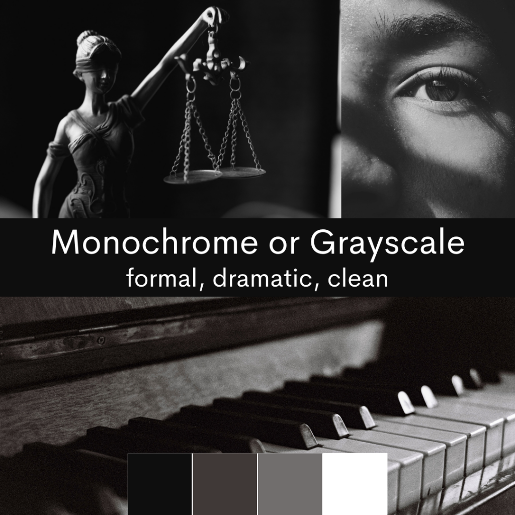
Monochrome Color Scheme
For an even more uniform appearance, you can opt for a monochrome color scheme. This scheme involves selecting a single base color and utilizing various shades and tints of that color. By employing a monochrome color scheme, you can achieve a more serious and clean look. A popular variation of the monochrome scheme is grayscale, which uses shades of black, white, and gray. Grayscale is ideal for creating a formal and sophisticated atmosphere.
The simplicity and versatility of a monochrome color scheme make it suitable for various purposes. For instance, a law office might employ a grayscale color scheme to establish a formal tone. Similarly, a drama actor’s portfolio could benefit from this serious, tasteful, and artistic style.
Complementary Color Schemes
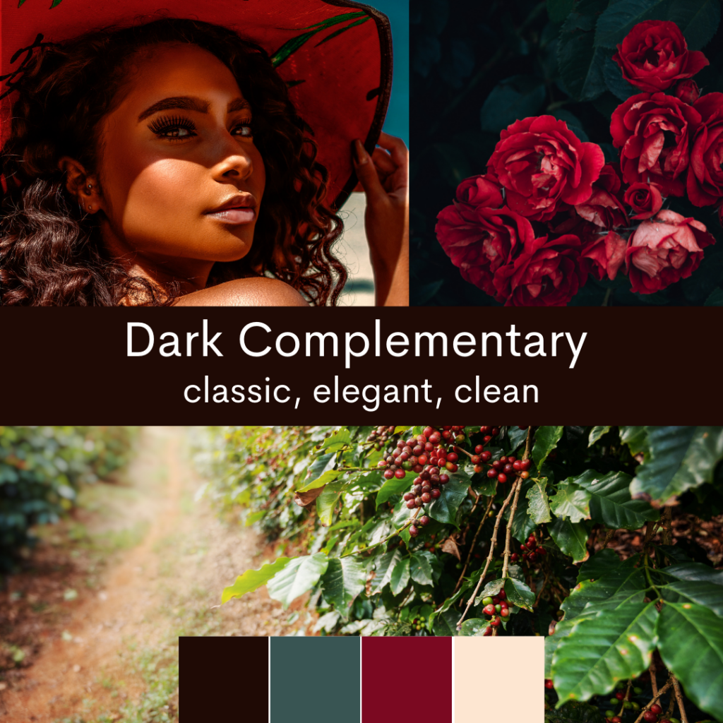
Dark Complementary
If you desire a vibrant pop of color that still maintains a professional appearance, consider a muted complementary color scheme. This scheme involves choosing two colors that are opposite each other on the color wheel. To maintain balance, one of the colors should be darker or muted, while the other can be brighter and more eye-catching. Additionally, incorporate black, white, or near-black and near-white shades to ground the design and add a professional touch.
This color scheme works particularly well for designs that seek a professional look with a touch of excitement. The contrast of green and burgundy balanced with charcoal, and off-white infuses romance with professionalism, making it perfect for establishments like upscale restaurants, hotels, or wedding venues.
Bright Complementary
On the other hand, if you’re aiming for a playful and exciting tone, you can choose vibrant complementary colors. However, it’s crucial to execute this scheme carefully to avoid clashing colors that might come off as chaotic or disorganized. When done well, a bright complementary color scheme can create an electrifyingly beautiful effect.
Bright complementary colors work effectively for brands focused on fun, excitement, or technology. If you search “orange and blue movie posters” on Google, you’ll find an endless list of successful movies that utilize this color scheme. Why? Because it’s thrilling, conveys a sense of futurism, and builds “hype”.
Tech companies often employ this color scheme to emphasize their exciting and futuristic
technology. Guilty-pleasure food and beverage companies, sci-fi books, and video games also leverage vibrant colors to build excitement. If your company must appear fun or exciting, a bright complementary color scheme will work well.

So, what colors should you choose for your website?
Ultimately, the colors you select depend on the message you want to convey to your clients and visitors. If you have existing company colors or a logo, it’s advisable to start with those as a foundation. From there, you can incorporate additional colors, including black and white, as necessary.
For a professional look, we recommend using two complementary colors, one of which stands out. Additionally, incorporate a shade of black and a shade of white into the scheme to ground your design. If you’re aiming for a more exciting or playful vibe, consider two bold and vibrant colors that contrast with each other, along with a darker and lighter shade to create a dynamic effect. Alternatively, for a cohesive and professional appearance, an analogous or grayscale color scheme may be the best choice.
Remember, the goal is to create a color scheme that helps tell your story to your audience effectively. By carefully considering the impact of colors and exploring various color schemes, you can design a visually appealing and engaging website that leaves a lasting impression on your visitors.
Lastly, don’t be afraid to get professional support. If you need help with custom graphics, SEO, digital marketing, or web design in Ventura County or Los Angeles County, we are here to help. Reach out for a quote on our expert services.