Your website is your digital storefront, a carefully crafted window display beckoning potential customers. But what if, instead of sparkling products and enticing visuals, your window showcased dusty mannequins and broken mannequins and broken glass? That’s the unfortunate reality for websites riddled with design mistakes that not only deter visitors but also tank your SEO performance. Here, we expose four common “design don’ts” and equip you with the tools to transform them into “design-dos.”
Don’t Be a Speed Demon (the Unwanted Kind)
Imagine a shopper struggling through molasses-thick aisles. That’s the experience of navigating a slow-loading website. Google prioritizes user experience, and slow speeds scream inefficiency. Fix it: Invest in website optimization tools, compress images, and ditch unnecessary plugins. Every second shaved off translates to happier users and better SEO ranking.
Broken Links
The Dead Ends of the Internet: Imagine reaching for a tempting product, only to find it chained to the shelf. Broken links do the same to website visitors, leading them to frustration and dead ends. Google sees broken links as red flags, hurting your website’s credibility. Fix it: Regularly audit your website for broken links using tools like Google Search Console and replace them with relevant, working links. Remember, a functional website is a trustworthy website.
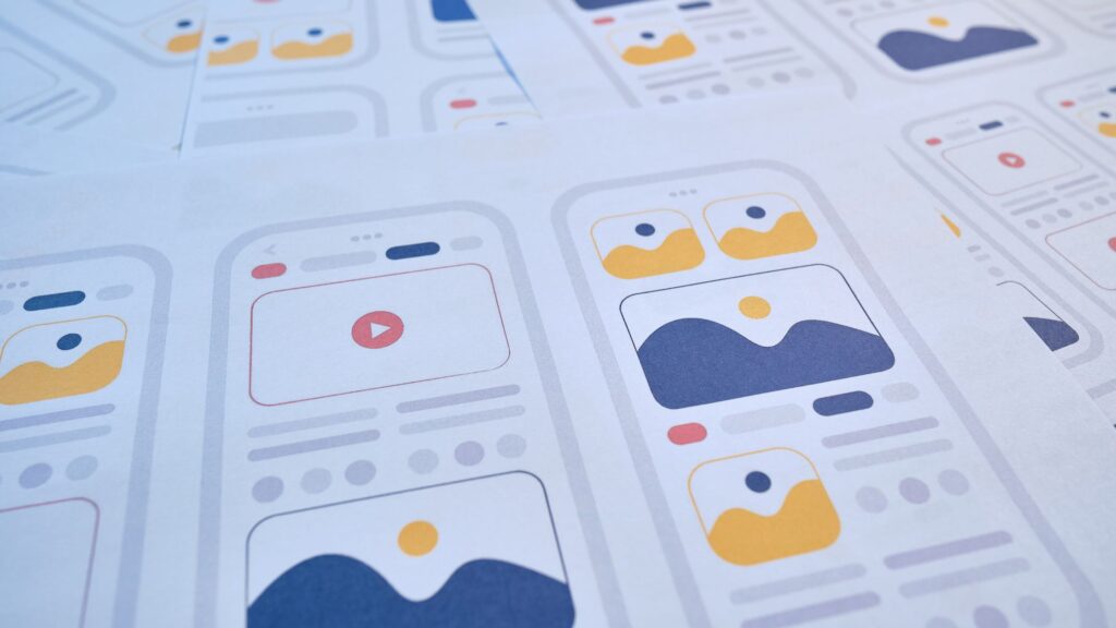
Image Overload
When Less is More (Much More): A picture might be worth a thousand words, but too many blurry, unoptimized images can drown out your website’s message and choke its SEO life. Images take time to load, dragging down your website’s speed and confusing search engines. Fix it: Optimize image sizes, use descriptive filenames and alt text, and consider alternative formats like infographics or videos. Remember, clarity and relevance are key.
Navigation Nightmare
The Lost and Confused Shopper: Imagine a maze with no exit signs. That’s what a confusing website navigation feels like. Inconsistent menus, hidden buttons, and unclear calls to action leave visitors disoriented and abandon ship. Google favors websites with logical, user-friendly navigation. Fix it: Simplify your navigation structure, use clear labels and calls to action, and make it easy for visitors to find what they’re looking for. Remember, a smooth journey leads to satisfied customers and search engine accolades.
By avoiding these design mistakes and implementing the suggested fixes, you’ll transform your website from an SEO graveyard to a thriving digital hub. Remember, good design isn’t just about aesthetics; it’s about creating a user-friendly experience that both humans and search engines love. So go forth, optimize, and watch your website climb the SEO ladder – and your conversion rates soar!